Risk Strategy
Dollars, Not Colors: Why Your Risk Heat Map Is Failing the Board (and How to Fix It)
A practitioner's guide to fixing the math underneath your risk heat map, so it produces decisions instead of decoration.
By Eric Kennedy · Tue May 19 2026 · 9 min read
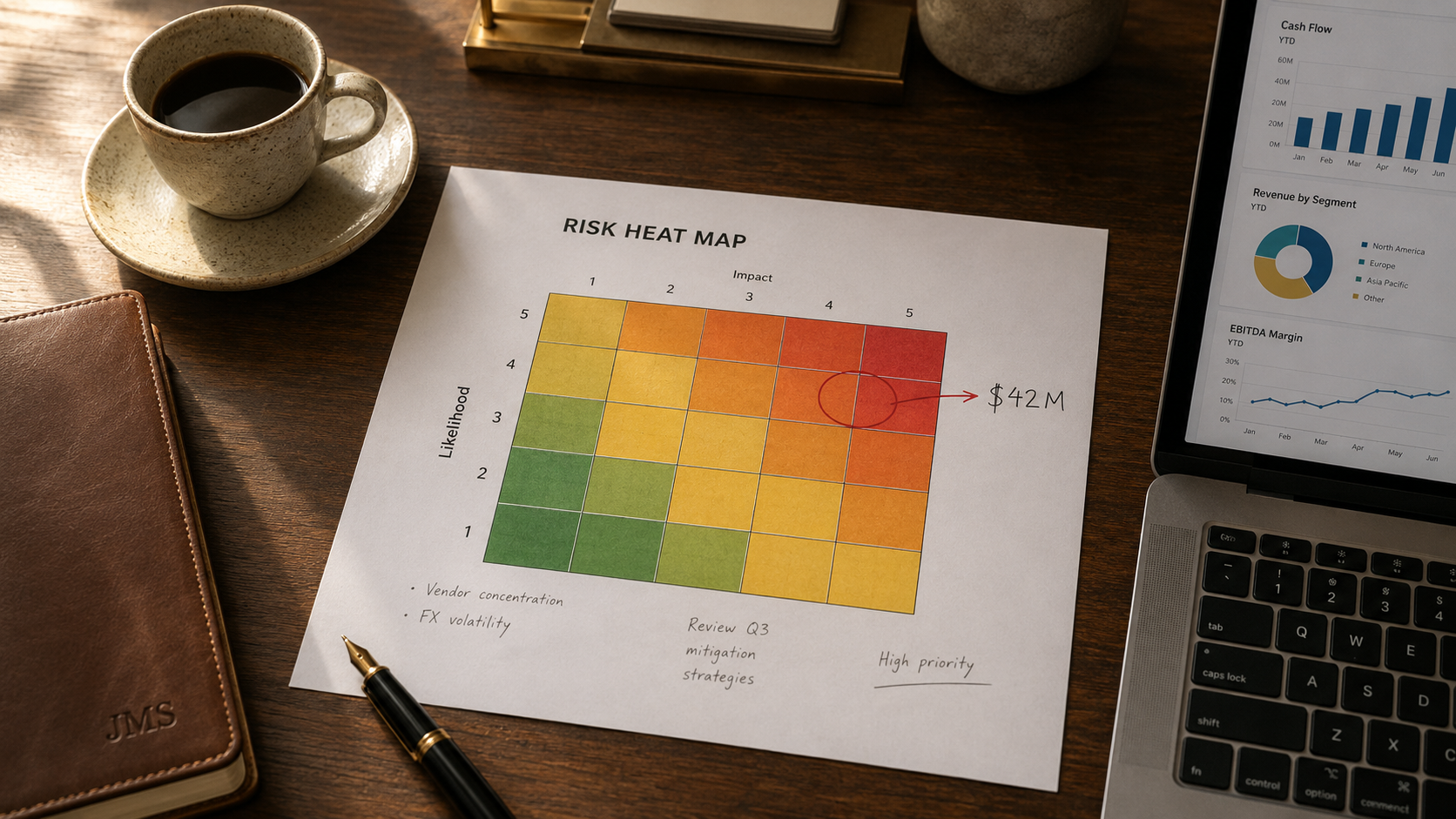
TL;DR: Most risk heat maps fail to drive board decisions because they are built on qualitative scoring (High, Medium, Low) that hides the financial exposure underneath. The fix is not better visualization. It is dollar-denominated impact scales, a deliberate inherent-versus-residual delta to show the ROI of controls, scoring inputs that go beyond gut feel, and a refresh cadence that matches risk velocity. This guide covers the four foundational decisions, the math problem underneath qualitative scoring (the Flaw of Averages), and a five-step build process for a heat map a CFO would actually use to allocate capital.
Most boards have seen the same risk heat map a dozen times. Bright red squares in the top-right corner, a few amber clusters in the middle, and a sea of green nobody questions. The board nods, files it away, and moves on. Nothing changes.
That is the compliance trap, and it is costing mid-market organizations more than they realize. A risk program that cannot translate exposure into dollars is not a risk program. It is a compliance calendar.
Per the AICPA and NC State 2025 State of Risk Oversight Report, only 11% of senior finance leaders view their organization's risk management process as a strategic competitive advantage, with 64% saying it provides no or minimal advantage. Sixty-one percent acknowledge that the volume and complexity of risks have changed mostly or extensively over the past five years, yet only 32% rate their oversight as mature or robust. Per Gartner's 2025 Trends for ERM Leaders, only 18% of ERM leaders express high confidence in identifying and managing emerging risks. The heat map is the artifact most executives use to track risk. If the heat map is broken, the executive view of risk is broken.
The fix is not a better template. It is a different mental model: dollars, not colors. Whether you call it a risk assessment heat map, an ERM heat map, or just the risk matrix, the data underneath the visualization has to be financial at the mid-market level, or the heat map will keep failing the board.
The four decisions that determine whether your heat map works
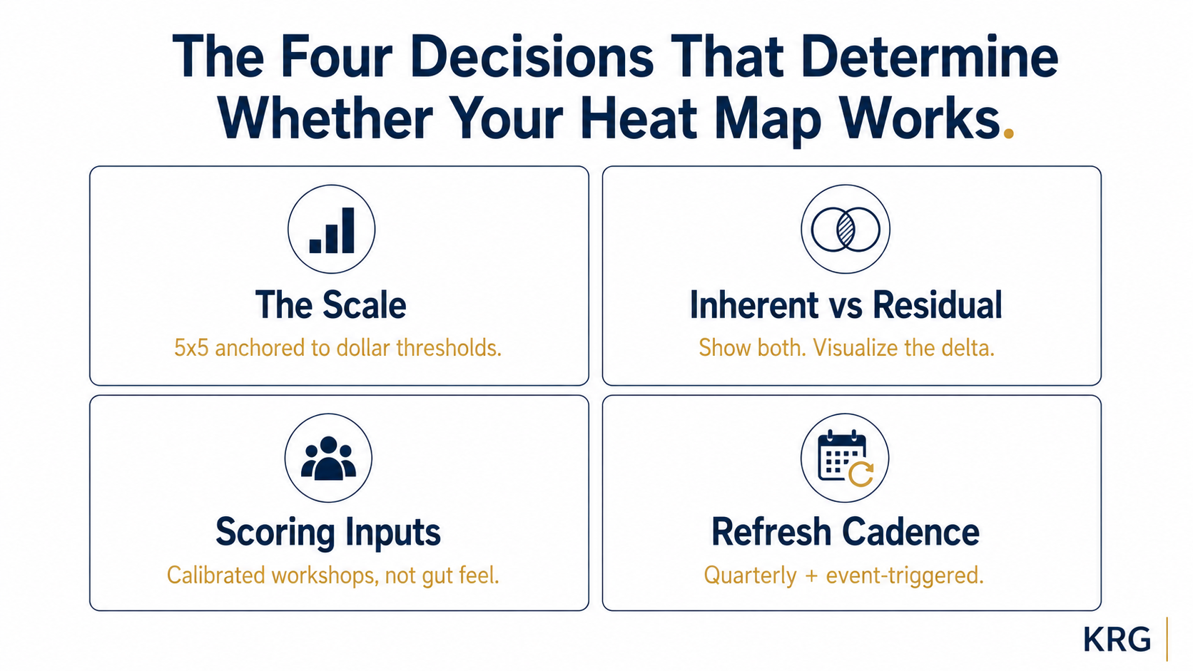
Before any visualization is built, four foundational decisions need to be made deliberately. These almost never get the attention they deserve, which is why most heat maps end up as polished artifacts that do not change behavior.
1. The scale
A 5x5 grid is the practitioner standard for the risk scoring matrix at mid-market companies. The likelihood impact matrix sits in the Goldilocks zone between too coarse and falsely precise. A 3x3 is too blunt to differentiate risks meaningfully. A 7x7 implies precision the underlying data cannot support. But the grid size is the easy part. The actual work is anchoring each level on the impact axis to a specific financial threshold. "Level 5 Impact" should mean something like ">$40M in lost revenue, regulatory penalty, or asset impairment." Without anchored definitions, two risk owners will score the same risk differently, and the map becomes a function of who filled out the spreadsheet rather than what the risk actually is.
2. Residual risk vs inherent risk
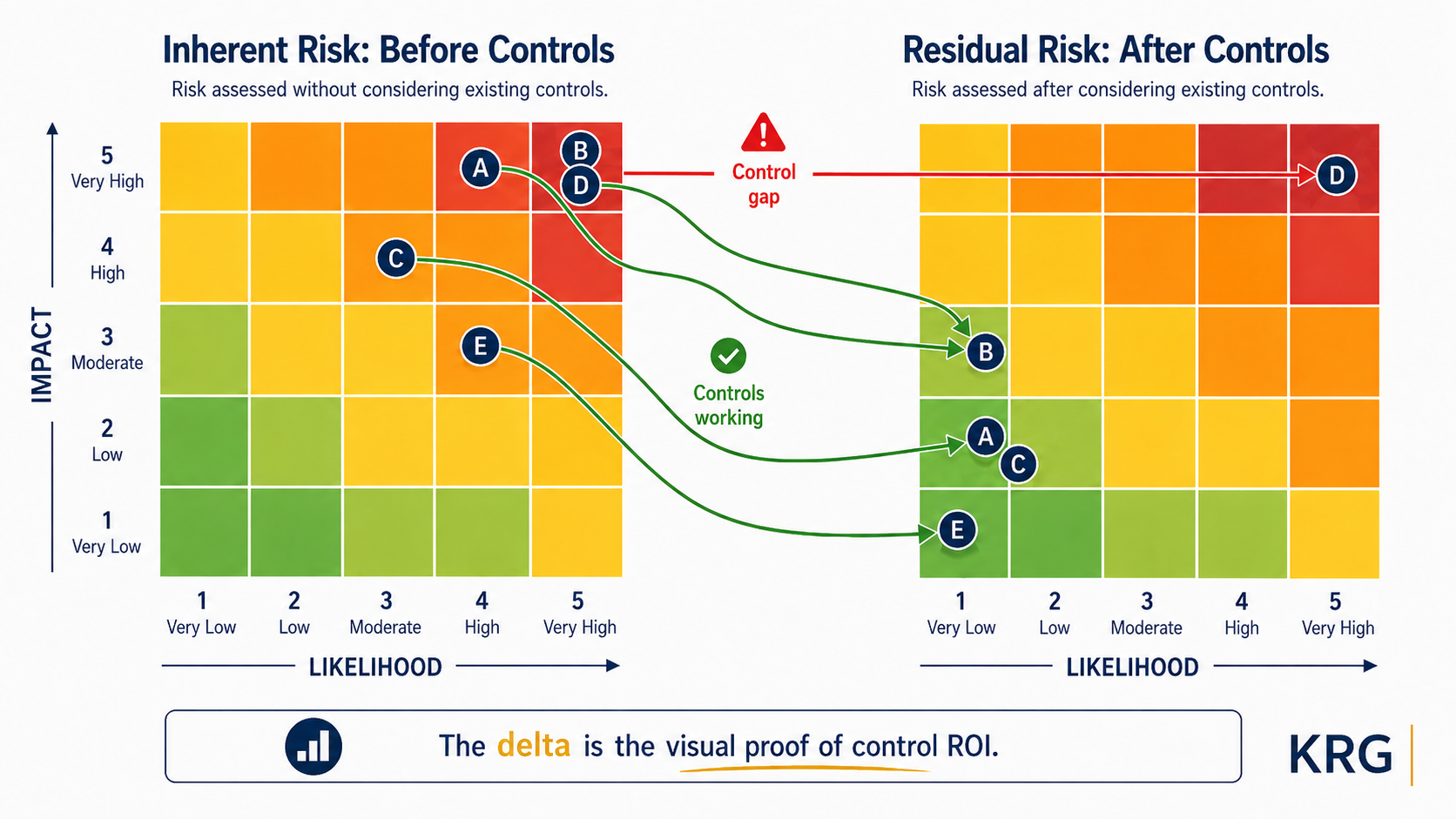
This is the decision most heat maps get wrong by skipping. Inherent risk is the risk before any controls are applied. Residual risk is what remains after controls are working as designed. A heat map that blends the two without naming which is being shown is not actionable. The right approach: produce both, and show the delta. The delta between inherent and residual is the visual proof of what your controls are actually doing. If a risk is high on the inherent map and unchanged on the residual map, your controls are not working. If it moves from red to yellow, you have demonstrated control ROI.
3. The scoring inputs
A risk score is only as good as the inputs that produced it. Gut feel from a single owner produces one kind of map. A structured workshop with calibrated scoring inputs (historical loss data, near-miss records, audit findings, external benchmarks) produces something that approaches the actual risk profile. Per Gartner's 2025 research, only 18% of risk owners provide high-quality information about their risks, and just 14% have effective mitigation plans. If you are scoring without independent validation, your map is closer to a survey of owner confidence than a measurement of risk.
4. Refresh cadence
A heat map updated once a year is a snapshot, not a management tool. A map updated quarterly with owner check-ins is a working artifact. For most mid-market companies, the right answer is quarterly refresh with a full reassessment annually, plus event-triggered updates after material business changes. Lock the cadence before you build the map, because the cadence determines whether the map gets used.
The integrating point: the quality of the heat map is set by these four decisions, not by the visualization itself.
| Design Decision | Common Mistake | Better Approach |
|---|---|---|
| Scale | 3x3 or 10x10 extremes | 5x5 anchored to dollar thresholds |
| Risk View | Inherent only | Inherent + residual, with the delta visible |
| Scoring Inputs | Owner self-assessment | Calibrated workshops with independent challenge |
| Refresh Cadence | Annual cycle | Quarterly + event-triggered |
The Flaw of Averages: why qualitative scoring breaks at the math layer
There is a deeper problem underneath qualitative risk scoring that most practitioners never name, and it has one: the Flaw of Averages. Dr. Sam Savage, an Adjunct Professor in Civil and Environmental Engineering at Stanford and Executive Director of ProbabilityManagement.org, wrote the book on this (literally, with John Wiley & Sons in 2009 and updated in 2012, foreword by Nobel laureate Harry Markowitz). The short version: plans based on average assumptions are wrong, on average. When you plug a single point estimate into a model representing an uncertain future quantity, you systematically misrepresent the underlying volatility.
Applied to risk heat maps, this shows up three ways.
The center-seeking problem. When scoring is qualitative and owners are uncertain, they cluster their scores around the middle of the scale. Risks pile up in the 3-by-3 center of the 5x5 grid because that is the safest place to score something. The map becomes uninformative because most risks look about the same.
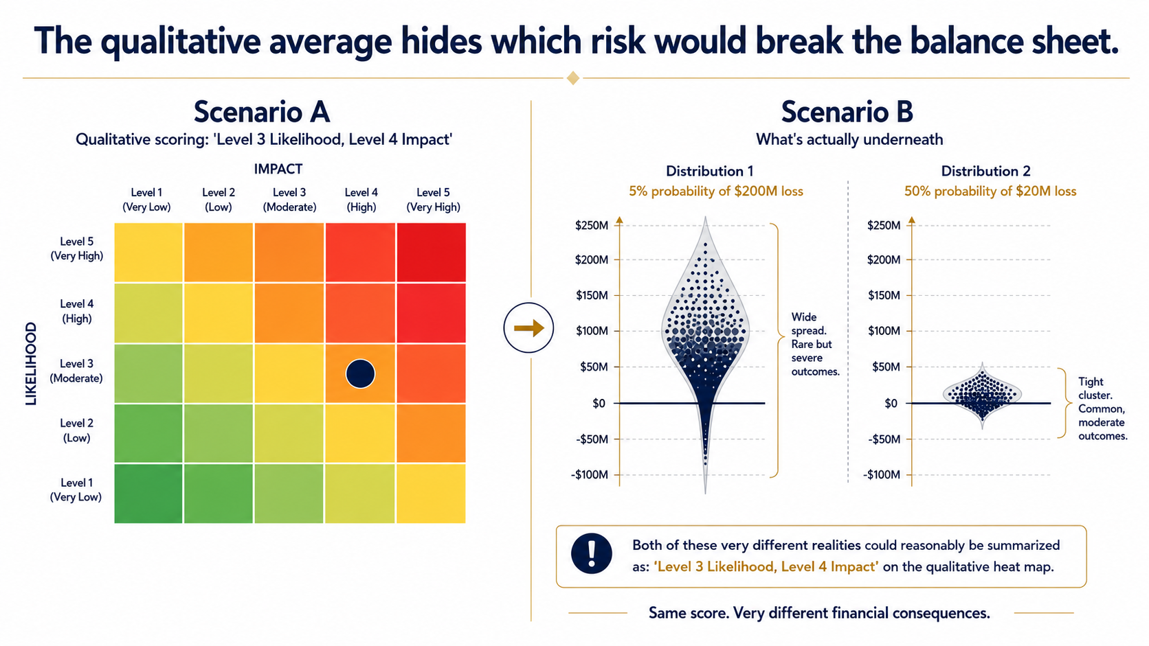
Tail risk gets hidden. A risk with a 5% probability of a $200M loss and a risk with a 50% probability of a $20M loss may average to the same expected value, but they are entirely different risks from a capital allocation perspective. A heat map that scores both as "Level 3 Likelihood, Level 4 Impact" tells the board nothing about which one would actually break the balance sheet.
Qualitative scores cannot be aggregated. You cannot add two "Mediums" and get a meaningful answer. You can add $10M of residual exposure and $15M of residual exposure and get $25M, which is useful. The math of qualitative scoring breaks at exactly the moment a CFO needs portfolio-level numbers.
Symptoms of a heat map suffering from the Flaw of Averages:
- More than 40% of risks plotted in the center two rows or columns
- No risk ever scores a 5 on likelihood, regardless of historical frequency
- Impact scores not tied to financial thresholds or documented assumptions
- Year-over-year maps that look nearly identical despite a changing risk environment
- "What is our total residual risk exposure?" is unanswerable in dollars
The fix is not more sophisticated colors. It is moving the impact axis from qualitative levels to dollar thresholds, and treating likelihood as probability ranges with stated time horizons.
The 5-step process for building a board-ready heat map
Once the four decisions are made and the math is honest, the build is straightforward.
Step 1: Define the risk universe and register. Pull every named strategic, operational, financial, compliance, and reputational risk into a working register. The quality of the heat map cannot exceed the quality of the register underneath it. Involve department heads, not just the audit team. Operational leaders surface risks that finance and audit will never see.
Step 2: Establish financial thresholds for impact. Anchor each level on the impact axis to a specific dollar range tied to revenue, EBITDA, or asset base. For a $200M revenue mid-market company, the anchors might look like: Level 1 (<$1M), Level 2 ($1M to $5M), Level 3 ($5M to $15M), Level 4 ($15M to $40M), Level 5 (>$40M). Align the thresholds to the same materiality definition your external auditors already use. That makes the scale defensible in any conversation with the audit committee.
Step 3: Calibrate likelihood using probability ranges and time horizons. Replace "Rare, Unlikely, Possible, Likely, Almost Certain" with stated probability ranges tied to specific time horizons. Level 1 might be "<5% in next 24 months." Level 5 might be ">75% in next 12 months." Where historical loss data exists, use it. Where it does not, use structured scenario analysis with named assumptions. The likelihood axis is harder to quantify than the impact axis, which is exactly why most teams default to vague labels. Push through it.
Step 4: Map inherent and residual, show the delta. Score each risk twice: once before controls, once after. Produce two heat maps. Show the executive team both, with the delta visualized as movement on the grid. If inherent and residual scores look nearly identical across the board, your controls are not being honestly assessed. That is the conversation worth having.
Step 5: Synthesize for the board (the "So What?" factor). A heat map is not self-explanatory. The risk function has to tell the story: which risks moved this quarter, why they moved, what changed in the business, and what management is doing about the top quadrant. Include a "what's changed since last quarter" summary. Boards respond to movement, not static snapshots. If the briefing does not end in three concrete decisions, the heat map did not earn its place on the agenda.
What the board-ready heat map should look like
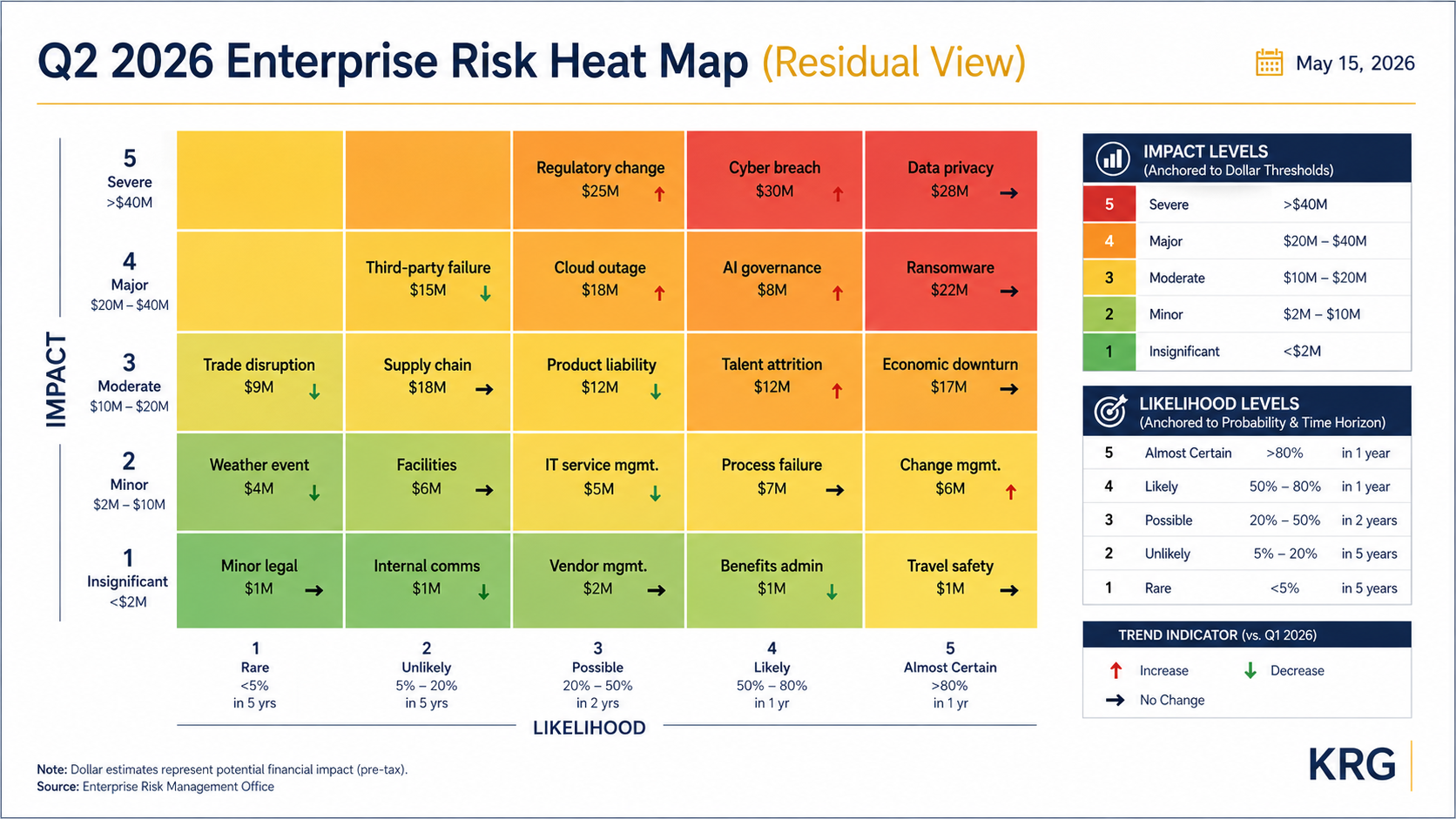
The output of this process is one slide. On that slide:
- The residual heat map is the primary visual, with 15 to 20 risks plotted by short name and dollar exposure.
- The inherent map and the delta are available as backup, ready to pull up when a board member asks what the controls are actually doing.
- A short legend explains the dollar-anchored impact thresholds and the probability-range likelihood scoring.
- Annotations call out the three to five risks that need a decision today and what changed since last quarter.
If you want to understand how AI tools are changing the scoring inputs that feed a heat map (and what they do not change), see our prior article on using AI in risk management for mid-market CFOs.
Key Takeaways
- Most risk heat maps fail because they rely on qualitative scoring (High, Medium, Low) that masks the financial exposure underneath. The board cannot allocate capital against a coloring exercise.
- Four foundational decisions determine whether the heat map will be useful: scale (5x5 with dollar-anchored impact levels), inherent versus residual (show both, visualize the delta), scoring inputs (calibrated workshops with independent challenge), and refresh cadence (quarterly minimum, plus event-triggered).
- The Flaw of Averages is the underlying math problem with qualitative scoring. Risks pile up in the middle, tail risk gets hidden, and qualitative scores cannot be aggregated into the portfolio-level financial numbers a CFO needs.
- Replace qualitative impact labels with dollar thresholds tied to the size of the business and aligned to your auditor's materiality definition. Likelihood should be probability ranges with stated time horizons, not adjectives.
- The board-ready mid-market heat map is one slide showing 15 to 20 residual-risk-scored items, with the inherent view as backup and the delta visible. The narrative is where the value lives.
- A heat map should change at least one decision per quarter. If yours does not, the problem is not the map. It is the discipline that surrounds it.
Where to Start
If your heat map looks polished but is not changing decisions, the fix is not better visualization. It is a sharper foundation: dollar-anchored scoring, a real inherent-versus-residual discipline, and the narrative rigor to make the artifact useful at the board level.
Risk Clarity Sprint ERM Diagnostic
The Risk Clarity Sprint (4 to 6 weeks) is built to fix exactly this. We rebuild the risk inventory, anchor the scoring framework to financial thresholds, separate the inherent and residual views, and stand up the narrative discipline that makes the heat map a real management tool. If you want a maturity assessment first, start with the ERM Diagnostic. The diagnostic fee is credited toward the Sprint if you move forward.
Frequently Asked Questions
Residual risk vs inherent risk: what is the difference on a heat map?
Inherent risk is the level of risk before any controls are applied. Residual risk is what remains after the current controls are working as intended. Most heat maps blend the two without naming which is being shown, which makes the map difficult to act on. The recommended approach for a mid-market company is to produce both views and visualize the delta. The residual map drives capital allocation decisions, the inherent map explains why the control program exists, and the delta between them is the visual proof of what your controls are actually doing.
Why is a 5x5 risk scoring matrix the standard?
A 5x5 matrix sits in the Goldilocks zone between coarse and falsely precise. A 3x3 grid is too blunt to differentiate risks meaningfully, especially in a portfolio of 15 to 20 enterprise risks. A 7x7 or 10x10 grid implies more precision than the underlying scoring data can support, and creates the illusion of analytical rigor without delivering it. The 5x5 is widely used in practice because it provides enough granularity to differentiate while staying interpretable.
What is the Flaw of Averages in risk management?
The Flaw of Averages is a concept developed by Dr. Sam Savage, an Adjunct Professor at Stanford University and Executive Director of ProbabilityManagement.org, describing the systematic errors that occur when single average values are used to represent uncertain quantities. Applied to risk heat maps, it shows up as the center-seeking problem (risks cluster in the middle of the grid), hidden tail risk (high-impact and low-probability events scored equivalently to low-impact and high-probability events), and the inability to aggregate qualitative scores into portfolio-level financial numbers. The fix is dollar-denominated impact scales and probability-range likelihood scoring rather than qualitative labels.
How often should a risk heat map be refreshed?
For most mid-market companies, the right cadence is a quarterly refresh with a full reassessment annually, plus event-triggered updates after material business changes (M&A, leadership turnover, regulatory shifts, major incidents). Once-a-year updates produce a snapshot rather than a management tool. Lock the cadence before you build the map, because the cadence determines whether owners take the scoring seriously and whether the artifact actually drives quarterly decisions.
How do you present a risk heat map to a board of directors?
The board-ready heat map is one slide showing 15 to 20 risks plotted on a 5x5 grid, scored at the residual level, with financial impact anchors visible in the legend, color-coded by quadrant, and labeled with directional trend indicators. Include a 'what has changed since last quarter' summary so the board sees movement, not just a static snapshot. The narrative that accompanies the slide is where the value lives: what moved this quarter and why, what management is doing about the top quadrant, what is on the emerging risks watch list, and what decisions the risk function needs from the board. If the briefing does not end in three concrete decisions, the heat map did not earn its place on the agenda.