Risk Strategy
Your Key Risk Indicators Are Measuring the Past
Most mid-market risk dashboards track things that have already happened. Here is what separates an indicator that changes a decision from one that documents a quarter.
By Eric Kennedy · Thu Aug 06 2026 · 8 min read

TL;DR
A key risk indicator is a metric tied to a specific exposure, an agreed threshold, a named owner, and a response defined before the number moves. Its purpose is not to describe performance. It is to trigger a decision while management still has options. Most of what mid-market companies call KRIs are operating metrics relabeled, which is why dashboards stay green until the quarter something goes wrong. The research on whether indicators predict anything is genuinely unsettled, and the most useful finding is that indicators presumed to be leading often turn out to run in both directions at once.
On March 23, 2005, an explosion at BP's Texas City refinery killed fifteen people and injured more than a hundred and seventy.
In the period before it, the refinery's safety numbers looked good. Personal injury rates were better than the industry average and had been improving. The independent panel that reviewed BP's US refineries afterward, chaired by James Baker, reached a finding worth reading twice: BP mistakenly interpreted improving personal injury rates as an indication of acceptable process safety performance. The panel concluded those injury rates were not predictive of process safety performance at all.
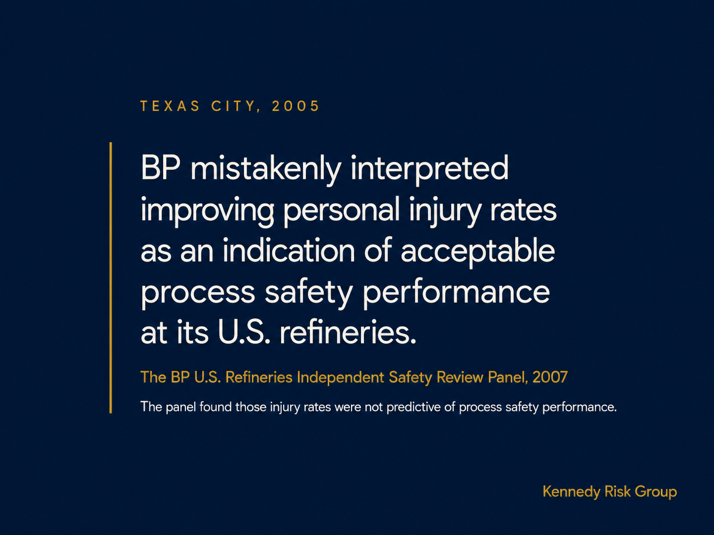
The measurement itself was not false. It was answering a different question. Personal injuries were being counted accurately and the trend was improving. But leadership treated that improvement as evidence about a different exposure, process safety, and the metric was valid for one purpose and not predictive of the risk that materialized.
BP was not short on formal safety infrastructure. What it had was a metric for one exposure being used as a proxy for another.
What a key risk indicator actually is
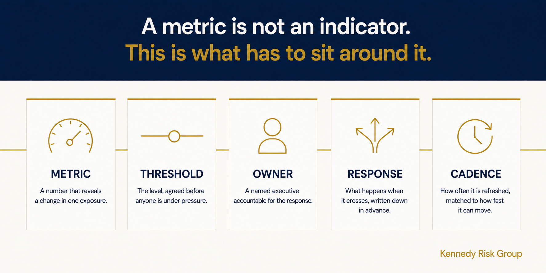
A key risk indicator is a metric that reveals a meaningful change in a specific exposure early enough to support a decision, paired with a threshold agreed in advance, a named owner, and a defined response.
Every part matters. The metric is only the starting point.
This is where most mid-market programs go wrong. Somebody asks for KRIs, and what comes back is a list of numbers the business already tracks: system uptime, voluntary turnover, days sales outstanding, on-time delivery, open audit findings. All useful. None of them is a risk indicator yet, because nobody has said what level is too high, who decides, or what happens next.
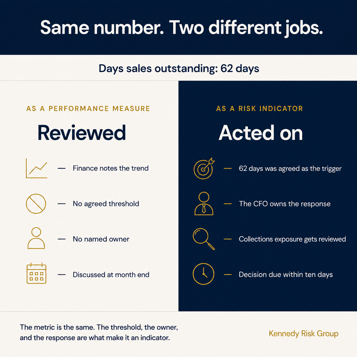
The distinction is not the metric. It is what surrounds it. Consider an illustrative example. Days sales outstanding is a performance measure when finance reviews it monthly and notes the trend. The same number becomes a risk indicator the moment a company decides that 62 days is the point at which management must review collections exposure, overdue receivables, and whether a small number of customers is driving the deterioration, and names who has to run that review.
Leading versus lagging is not enough
Most writing on this subject spends its length on the distinction between leading and lagging indicators, as though sorting your metrics into two buckets is the work.
The distinction is useful. It is not sufficient. A metric can move early and still fail as an indicator if no threshold or response has been defined.
The more useful question is about timing relative to a decision. Does this number move while you can still do something, and is what you would do actually defined? An indicator that turns red the same week the customer leaves is not leading, whatever you call it. An indicator that moves six months out but triggers no action is not useful either.
The evidence is more mixed than either side admits
There is a real research literature here, and it does not resolve into a clean leading-versus-lagging distinction.
A five-year analysis of safety indicators on a large Australian infrastructure project found something that should give any dashboard owner pause. Indicators presumed to be leading both led and lagged the recorded injury rate. Toolbox talks, audits, and behavioral observations helped predict future injuries, and injuries helped predict future toolbox talks, audits, and observations. The relationship ran in both directions. The authors concluded that the traditional assumptions behind the leading and lagging labels should be reconsidered.
Read that carefully, because it is not the same as saying the indicators failed. They carried real signal. The problem is that some of what looked like early warning was also a reaction to something that had already happened, and from inside the dashboard the two are indistinguishable.
A separate 2016 study of 3,578 employees across 66 workplaces did find an association between leading and lagging indicators. That relationship was moderated by middle-management safety leadership. Where managers engaged with the indicators, the link held. Where they did not, it weakened.
None of this proves that accountability can turn any metric into a predictor. It supports something narrower and more useful: indicators do not work independently of the management system around them. The number matters. It does not work alone. Its usefulness depends on the threshold, the owner, the response, and whether leadership acts while there is still time.
That should change where you spend your effort. Selecting the metric is only part of the work, and it is the part most programs spend nearly all their time on.
There is an honest limit worth stating. This research comes from occupational health and safety, not enterprise risk in mid-market companies. Applying it to supplier concentration, liquidity, key-person dependency, or cyber exposure is reasoned inference, not proof.
The five parts of a working indicator
A working indicator has five design elements: a metric, a threshold, an owner, a response, and a cadence. Once those are defined, five tests tell you whether it will hold up in practice.
Five tests for whether the indicator will work
It changes early enough to act. Test this directly. Look back at the last exposure that actually cost you something and ask what changed first, and how long before. If the honest answer is that nothing visible changed in time to matter, you are looking for a different indicator, not a better threshold.
It tracks one exposure, not general health. "Employee engagement score" is a condition. "Voluntary turnover in the three roles that would take six months to replace" is an exposure. The second one you can act on.
The threshold is set before anyone is under pressure. A threshold agreed after the number moves will be set wherever avoids the difficult conversation. This is the most common failure and it is invisible, because the dashboard still looks disciplined.
It has an owner who is accountable for the response, not the number. Somebody always owns updating the spreadsheet. That is not ownership. Ownership means a named executive has agreed that when this crosses, they act, and they will be asked why if they did not.
It is cheap enough to actually update. An indicator requiring three people and a data pull will be refreshed for two quarters and then quietly stop. A worse metric you update monthly beats a better one you update never.
Where mid-market companies should look first
For most mid-market leadership teams, I would start with eight to twelve enterprise-level indicators. That is usually enough to cover the exposures capable of changing the year without turning the review into a status recital.
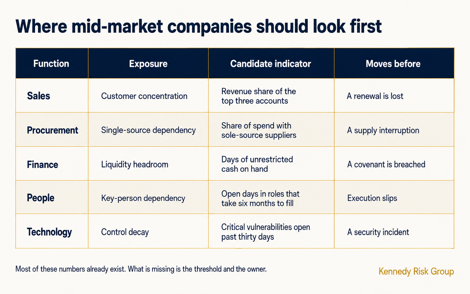
The pattern worth noticing in that table is that most of these numbers already exist somewhere in your business. Procurement knows lead times are stretching. Sales knows the renewal conversation went differently this year. Quality knows the defect rate ticked up.
What is missing is not measurement. It is that nobody has connected those numbers to a named exposure, agreed what level is too high, or routed them to someone with the authority to act. That is the same problem that shows up when a company outgrows what one person can hold in their head, and it is why the fix is organizational rather than analytical.
How often, and what happens when one turns
Two practical decisions get skipped and then cause trouble later.
How often. Match the cadence to how fast the exposure can move, not to your meeting calendar. An indicator reviewed less frequently than the exposure can materially change is theater. Different indicators can and should run on different clocks.
What happens when one turns. Write this down before it happens. Not "escalate to management," which means nothing, but who is told, within how many days, and what they are expected to decide. If the answer is that it gets discussed at the next quarterly meeting, the indicator is not doing anything a calendar could not do.
The exact number of indicators matters less than whether leadership can review all of them in one decision-oriented conversation. That is also what separates a register from a program. A register records what you know. Indicators with thresholds and owners are what turn that record into something that moves.
What this does to your board reporting
The practical payoff is in what leadership sees.
A heat map tells the board what management believes the major risks are. Indicators tell it which exposures are changing, how quickly, and who owns the response. That second question is the one that gets asked in the room, and it is the one many board reports still do not answer clearly.
If you are building toward board-ready reporting, a small number of indicators with direction of travel and a named owner does more than a full-page grid of colors. Three exposures with arrows and owners beats twenty risks with ratings, because the first supports a decision and the second supports a discussion.
Where to Start
If you already have a risk register and are trying to work out which indicators to attach to it, the fastest useful step is a read on where your reporting actually stands today.
The KRG scorecard gives you a tier-level assessment in seven questions and about two minutes, with no email required to see your score.
If indicators and executive reporting are the specific gap, the Executive Risk Reporting engagement builds the indicator set, the thresholds, and the reporting cadence in three to six weeks.
Take the Board-Reporting Scorecard Explore Executive Risk Reporting
Frequently Asked Questions
What is a key risk indicator?
A key risk indicator is a metric that reveals a meaningful change in a specific exposure early enough to support a decision, paired with a threshold agreed in advance, a named owner, and a defined response. The metric alone is not an indicator. A number that nobody has attached a threshold or an owner to is a measurement, and it will be reviewed rather than acted on.
What is the difference between a KPI and a KRI?
A key performance indicator measures how the business is doing. A key risk indicator measures how exposed the business is becoming. The same number can serve as either, depending on what surrounds it. Days sales outstanding reviewed monthly for trend is a performance measure. The same figure with an agreed threshold, a named owner, and a defined response when it is crossed is a risk indicator. The difference is the threshold and the accountability, not the metric itself.
How many key risk indicators should a company have?
For a company between $50M and $750M in revenue, eight to twelve is a practical starting range, based on how mid-market reporting tends to work rather than on any empirical standard. Some companies need fewer and some need more. The enterprise view should stay small enough that executives can understand what changed, who owns the response, and what decision is required, in a single conversation. Business units may track more of their own.
Do leading indicators actually predict risk events?
The evidence is unsettled. A five-year analysis of safety indicators on a large Australian infrastructure project found that indicators presumed to be leading both led and lagged the recorded injury rate, with the relationship running in both directions, and concluded that the traditional leading and lagging assumptions should be reconsidered. A separate 2016 study covering 3,578 employees across 66 workplaces did find an association between leading and lagging indicators, moderated by middle-management safety leadership. Taken together, the research suggests indicators do not operate independently of the management system around them. Note that this literature comes from occupational health and safety rather than enterprise risk.
How do you set a threshold for a key risk indicator?
Set it before the number is under pressure, using history where you have it and judgment where you do not. Look at the level the metric reached before past problems and set the threshold below it, so there is time to act. Where there is no history, ask what level would make the exposure owner change their plans, and use that. The critical discipline is timing: a threshold agreed after the indicator has already moved will be set wherever avoids an uncomfortable conversation.